How to adjust chart axis?
Infogram offers you a variety of additional settings for customizing charts and displaying your data.
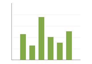
By default, charts automatically assign an axis range, starting from 0, up to the maximum value. If your data values are large, it might be hard to compare the differences between elements. Having the axis starting point from a different value will make the distinctions between elements more obvious.
To adjust the chart axis:
1. Click to select your chart, then expand the Axis & Grid tab in the right sidebar.
2. Enter the axis start and/or end values to adjust the axis range.
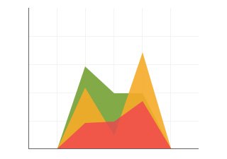
You can also add labels to the axes and enable or disable gridlines in the chart background. Grids can make your data easier to follow, but can also be distracting in some situations. Use grids if the value of each specific data point is important.
Enabling the Fixed grid in all sheets setting will lock the range of the chart axis across all data sheets in your chart based on the largest value in the whole dataset. Use this setting if you are, for example, comparing the same elements over a period of time and intend to have the user click on the tabs above your chart to compare the data and see how it has changed during time. This way, the increase or decrease in values will be clearly visible as the axis range will not change. Don’t use this setting if you are comparing different elements in the tabs or the chart visualization will differ significantly.
To enable the zero baselines:
1. Select the chart with a click.
2. In the Axis & Grid tab of your chart settings, in the Grid drop-down, choose None, Vertical or Horizontal.
Note: The horizontal zero baseline or vertical zero baseline setting will appear when you choose to display the gridline perpendicular to the axis.
3. Enable the horizontal zero baseline or vertical zero baseline setting.
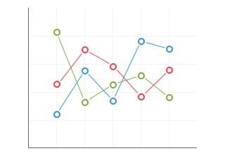
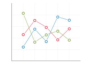
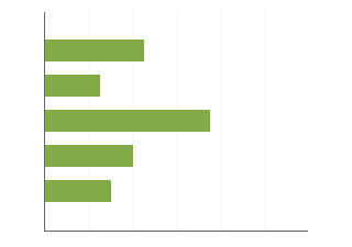
To adjust settings in a line chart:
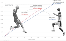
If you are using a line chart, you can flip the chart axis so the lowest values are at the top:
1. Click to select your chart, then expand the Axis & Grid tab in the right sidebar.
2. Enable the Flip chart option.
By default, line charts use a date format for the top row column. Here you can also enable Numeric categories to treat the values as plain numbers. That this setting works with numbers and not date/time formats.
If you have only a few data points and would like for your line to have smoother angles, you can enable the Smooth curves option which can be found by expanding the Chart properties tab in the right sidebar.
Tip: Don’t use this option if the exact position of your data points is significant.
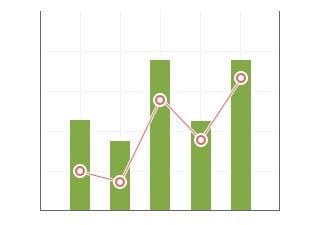
You can also add or remove the value point dots your line. This makes it easier to call attention to specific values, directing viewers to specific bits of information. With large datasets, points are turned off automatically when the chart area becomes overcrowded. View more


 Infogram